Redesigning the PostNord App Icons
Written by: Jozsef Deak
If you are a designer and someone asks you to design an app icon, the chances are that your answer will be something like: “sure, give me 2-3 days, and I will have it ready”. I don’t judge you, because this was precisely my answer when I heard that we were going to redesign the PostNord app icon. And boy, I was wrong. Luckily I’m fortunate enough to work with amazing people with better estimation skills than me, who pulled me back to reality and helped me tackle this project the right way.
But back to the beginning.
The project
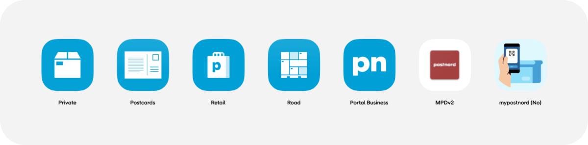
PostNord is one of our oldest partners, and we work with them on some of their web projects and three of their mobile apps:
While these apps have undergone redesigns in the past years, their app icons stayed the same. The only thing they shared was the blue background, but the style of the symbols was quite different. They looked outdated and did not feel like they belonged to the same brand.
PostNord had a significant rebranding at the beginning of 2021, and building on the rebranding work and adapting it to the digital environment, we updated all the apps to follow the new brand and design language. This also felt the right time to update and align the app icons. So, together with PostNord, we set out to do exactly this.
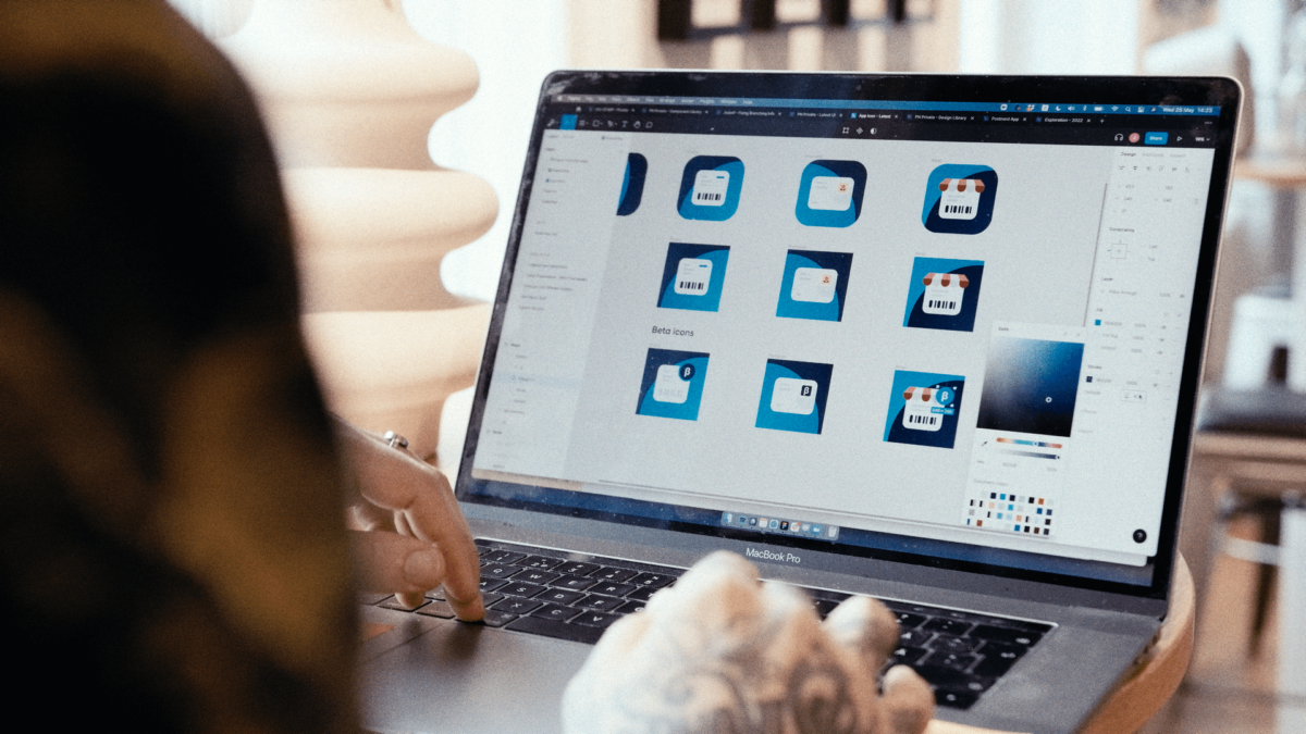
Right from the beginning, we knew we did not just want to design three individual app icons. We aimed to create an app icon suite and develop a system that could be applied when designing app icons for other current and future PostNord apps.
The goals for the new app icons were:
The process
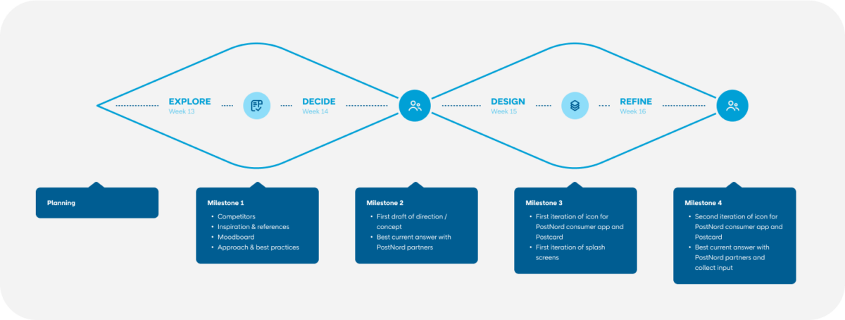
Designing an app icon suite can be challenging, and starting with a blank canvas is scary. We also had a deadline for the project; the rebranded apps launch was due in 5 weeks. We needed a plan and a well-defined process to guide us and keep us on track.
We decided to use the double diamond method and set clear goals for the end of each stage, which we synced with the brand and marketing teams at PostNord before kicking off the project. It was essential for us to involve our partners in every step of the process and to set clear goals, expectations, and deliverables at the beginning of the project to make sure everyone was on the same page and avoid any surprises along the way.
Goals set, planning done, it was time to get our hands dirty with all that pixel dust.
Research & exploration
We knew from the beginning that the research and exploration phase would take at least half of the time we dedicated to this project. Still, we were confident that if we did it right, we would have all of our questions answered, and the actual execution would be a walk in the park (well, sort of).
These two things went hand in hand. We started researching, saw something which inspired us, did some quick paper sketches, went back to research, did some more drawings, and so on.
Remember the goals we set for the app icon? We wanted it to be uniquely PostNord, and we wanted it to be easy to find on the screen, so the first thing we looked at was other app icons. Of course, we were planning to design one ourselves after all.
We divided this part of the research into four small pieces.
It’s impossible to figure out all the possible ways people group and order their apps on their phones, but to give ourselves some starting point, we looked at three possible ways this could happen:
We also tested how our app icons look on different types of backgrounds. We tried backgrounds with very few visual details, some more busy ones, as well as trying them in dark mode. We also checked their appearance in the App Store and notifications (primarily for legibility). For this, we created a little Figma asset with components that you can download from here. We used this to test mocks during the whole project.
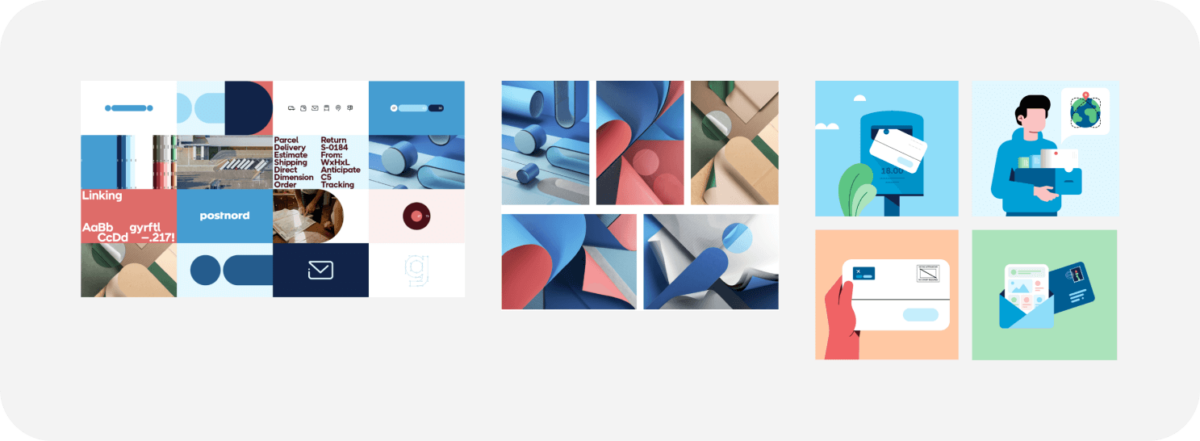
Next, we started digging into the new PostNord brand guidelines to identify the elements that can carry the brand, communicate that this is a PostNord app and the elements that convey the function of the different apps. So basically, “this is a Postnord app, and it is for X.”
The new brand was built around a rounded shape called The Link. It’s included in some parts of the UI on both web and mobile and in printed and digital media in the different service points and ads. We also designed the icons and illustrations used in the UI around the link shape, so it felt like one of the obvious choices to explore.
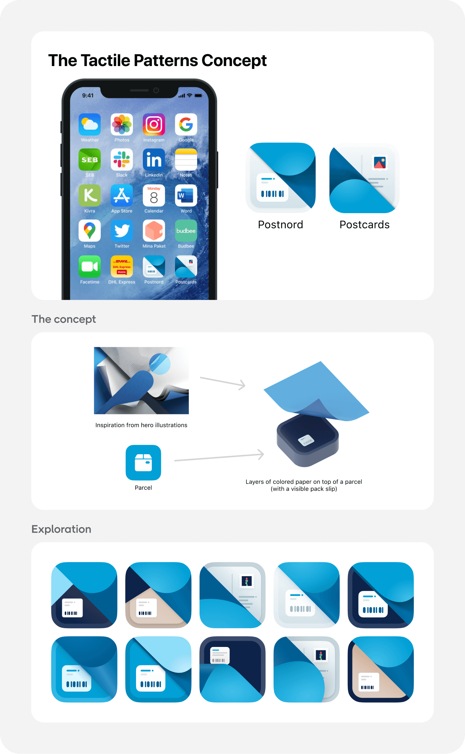
Other brand carriers we explored were the 3D paper-like renderings referred to as tactile patterns, which symbolize different types of packaging and the joy of opening a newly received parcel, the new color palette, and the new illustrations we made.
The various icons and illustrations were also a good starting point for exploring graphical elements which could act as symbols, representing the key functionality of each app.
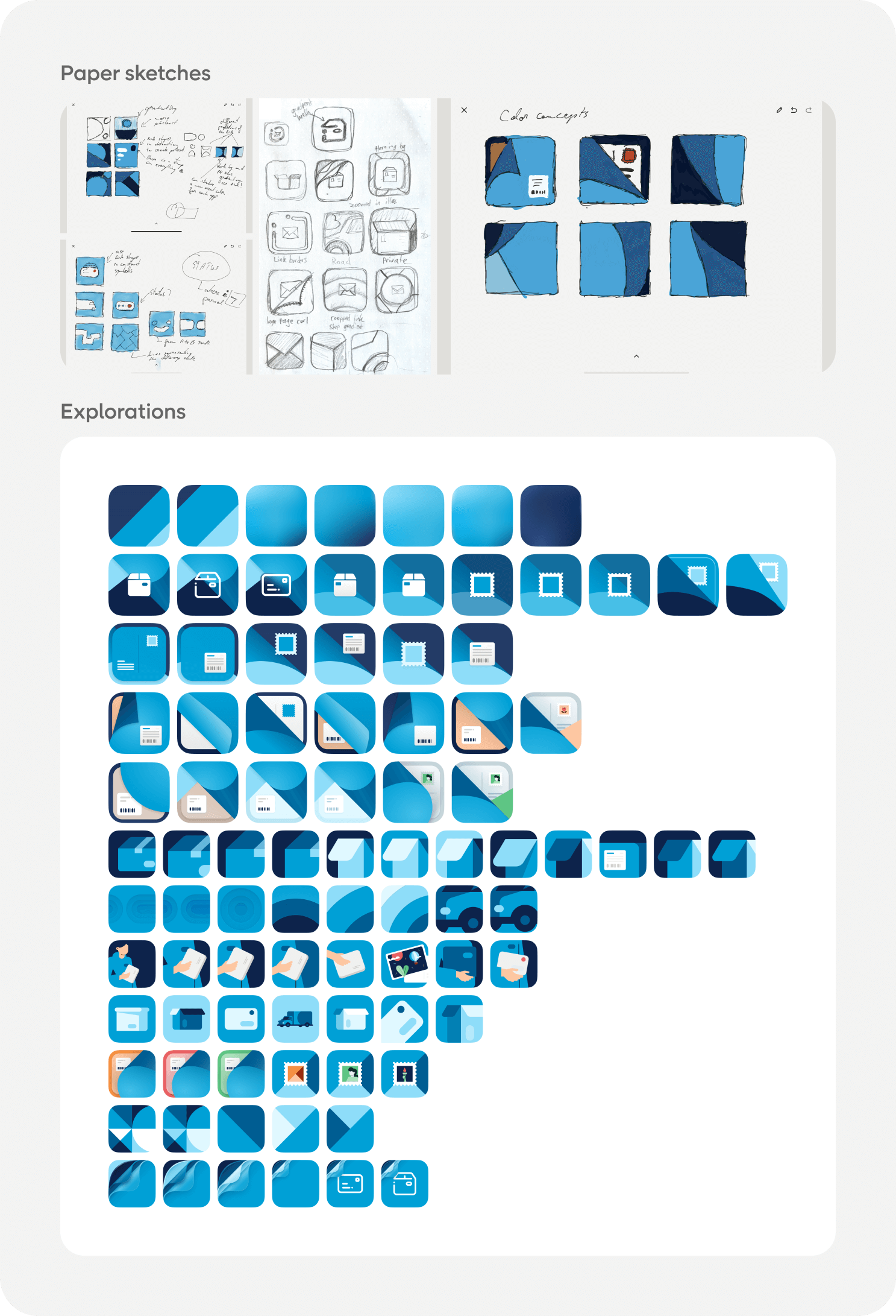
Early explorations
Focusing on quantity over quality, we wanted to explore as many directions as possible in a relatively short time. We started with pen and paper sketches, followed by rough mocks in Figma. The goal was to learn what works better but, more importantly, what does not work. We experimented with about 20 different styles, making over 200 drafts.
What we learned:
Narrowing down, focusing on two concepts
Once we knew what did not work, we could focus on what did. After eliminating a lot of possible directions, we were left with two concepts we liked and felt confident with.
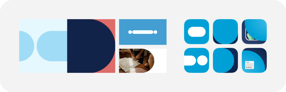
The Link
The link is the most used element in the brand, so it felt natural to try doing something with it for the app icons. The shape’s simplicity gave us many opportunities to explore both symbols and background elements.
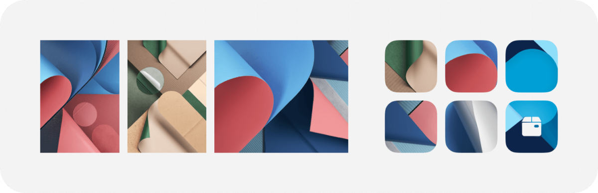
Tactile patterns
The second concept we explored was based on the tactile patterns, the 3D paper-like renderings that were also introduced with the rebranding. By glancing at them, we saw some exciting crops that kept our imagination going. Because they symbolize the joy of opening a newly received parcel, we thought this metaphor could be applied to the excitement of “unwrapping” the app and getting an update on your package.
Now that the brand carrying elements, the link shape, and the tactile patterns were decided, we started exploring different alternatives for symbols representing the functionality of the apps. It was time to go wide again and explore. Starting with obvious things like the box (yes, I know, but we needed to try), iterations of our icons used in the UI, parts of our illustrations and we also created symbols using the link shape.
While working with the link shape felt more straightforward, finding the suitable crops from the tactile patterns and recreating them in a style that fits the project was a more significant challenge but also a lot of fun.
After some back and forth and a lot of design reviews, we ended up with two concepts that we felt pretty happy with.
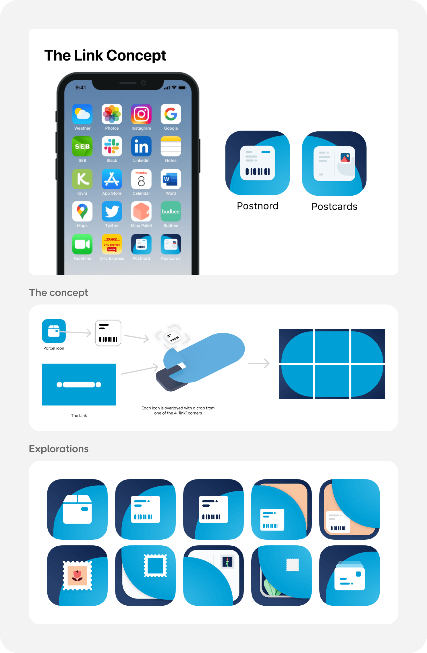
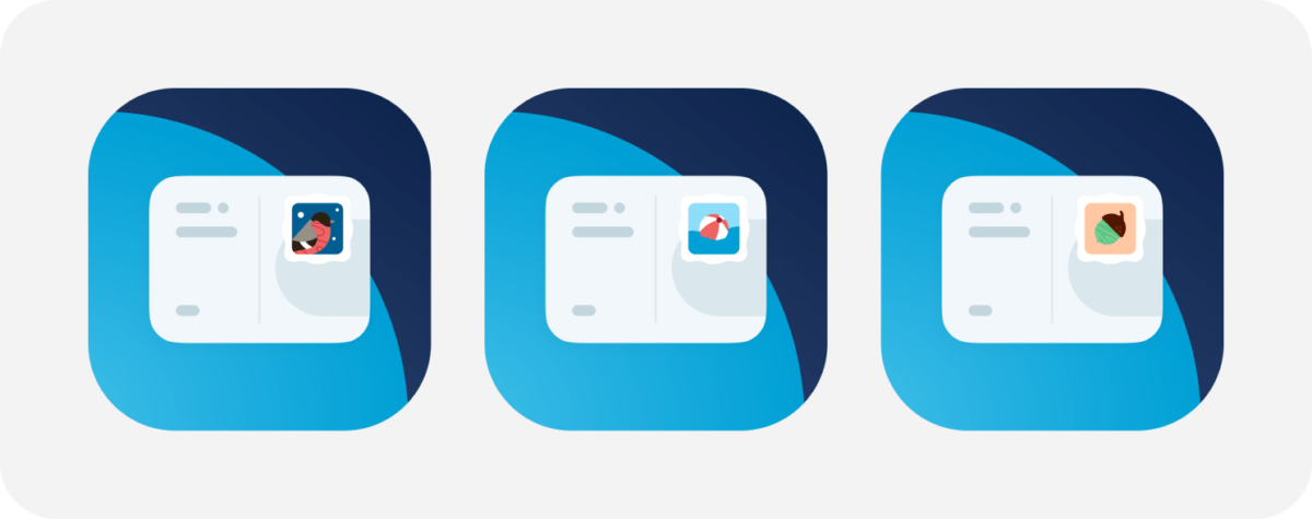
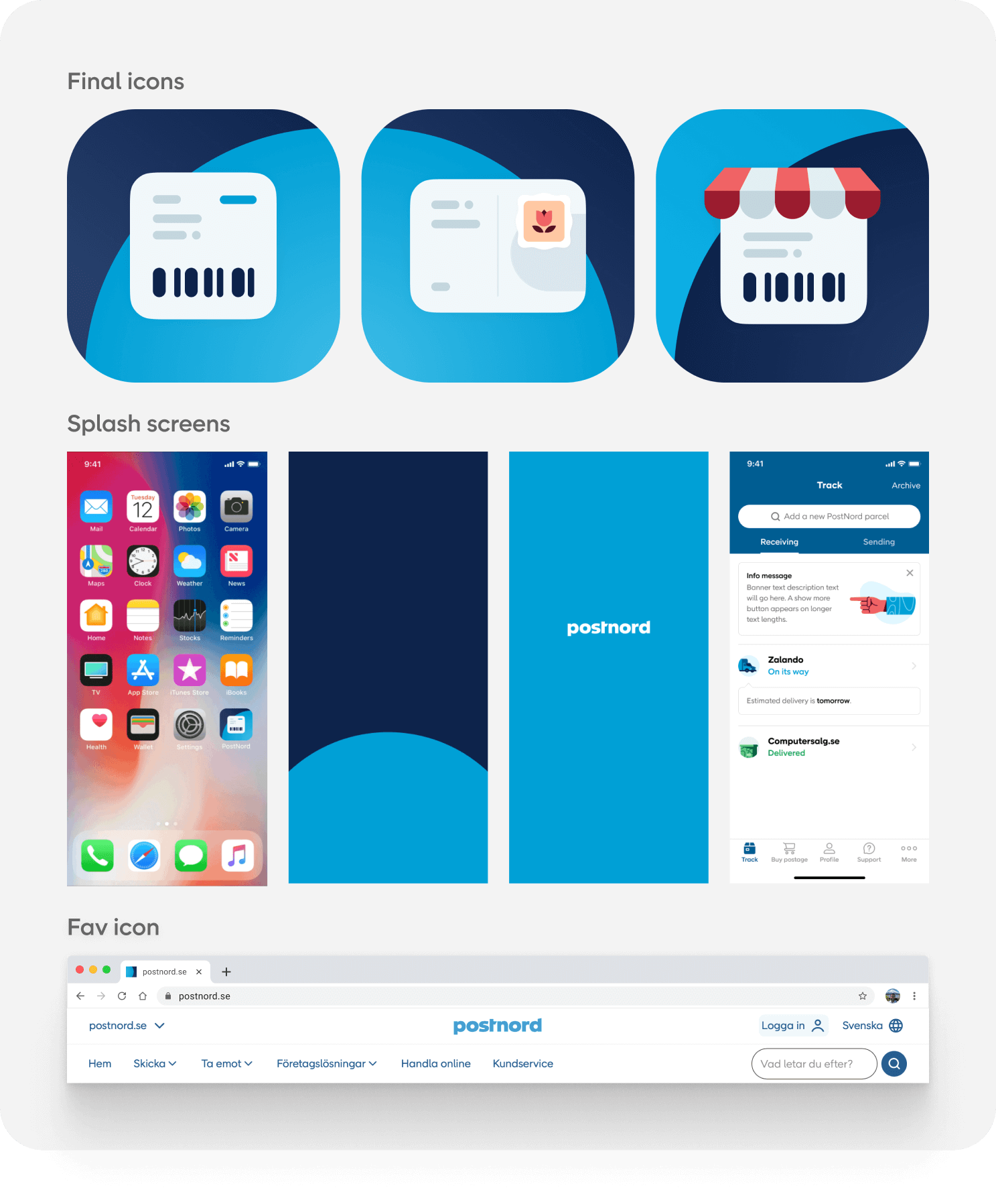
Coming up with a symbol for the Postcards icon was straightforward. It should be a postcard. We experimented with different styles, starting with using parts of our illustrations and icons, and ended up on clean rounded card shape and used the link shape in different sizes to add some details to resemble the printed postcards more. The symbol we got, as a result, was bold and legible enough on smaller sizes, followed the concept of the link, and it’s easy to make minor adjustments to make it fit possible future trends if wanted. Inspired by our illustrations, we also added a stamp to the symbol. The stamp graphic changes with every release, matching the actual season, holiday, or a specific physical stamp used on the printed cards.
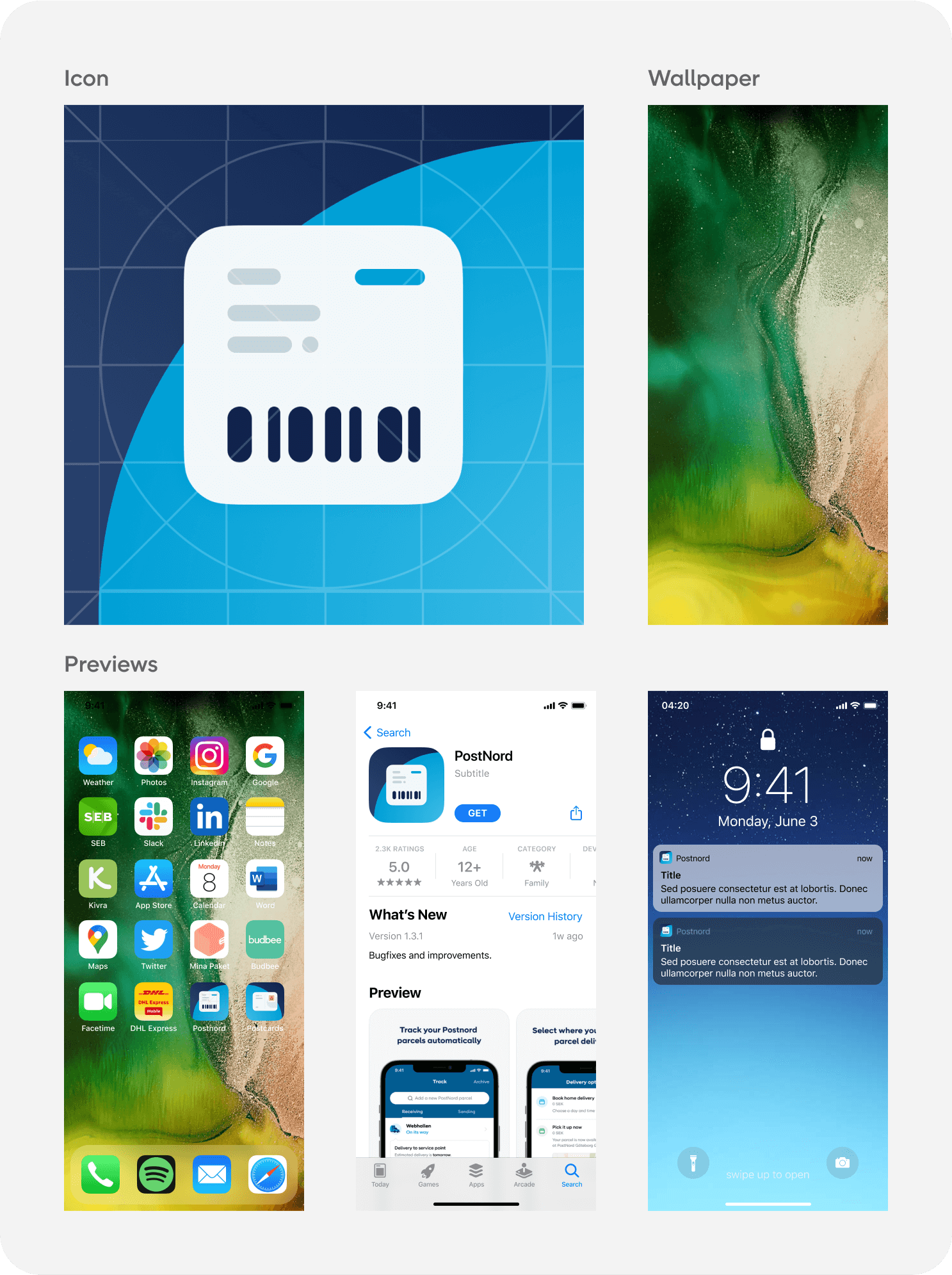
The symbol for the customer app was a harder nut to crack. Based on the learnings from our research and early explorations, we knew that we wanted to stay away from the box and the Postnord Logo. Parcels come in all shapes, sizes, and colors, and the logo is not very legible when put on an app icon. We tried to create a symbol that users can easily connect to both the app and the physical parcels. We ended up using the shipping label, which can be found on packages, and designed it in the same style we did the Postcards symbol.
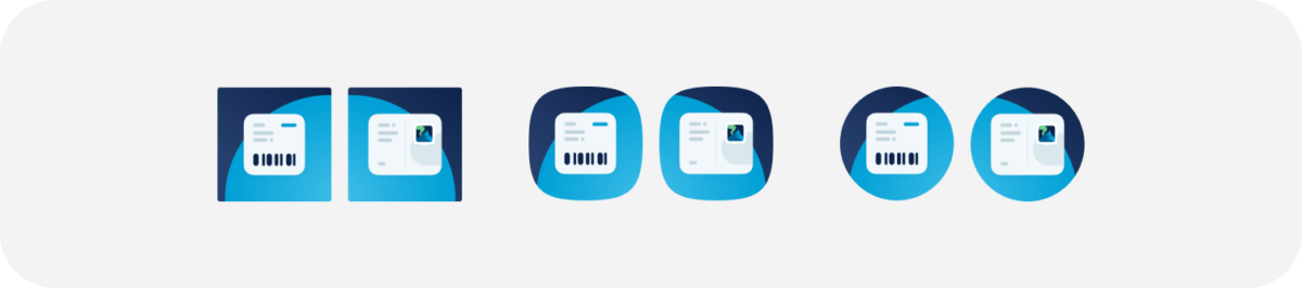
During this stage, we constantly tested our concepts using the Figma file mentioned above in different setups. We also tried them in all the different shapes android icons come in.
Picking the final concept, refinements
While we all loved the tactile pattern concept, and it was so much fun to explore something different, everyone felt that the link concept was the way to move forward. It felt more in line with the UI of the apps and the new brand, it felt more PostNord, and more importantly, it felt like an upgrade to our existing app icons, making it easier for users to recognize the new icons on their home screens. The link concept was also easier to adapt for other internal Postnord apps. After some minor tweaks on the symbols to make them easier to separate, we ended up with the final designs.
Based on the principles established during the process, we also created an icon for the Retail app and splash screen animations for all apps matching the new app icons and concepts for different favicons for the web.
Final design
Everyone involved was super happy with the end results, it was a true team effort. Earlier this year, the PostNord app icon was published in The App Icon Book, a nice coffee table book showcasing app icons from all over the world. We are honoured to be included in such an amazing project among some of the most iconic app icons of the past decade.
Reflections
A clear plan defined at the beginning of a project makes asynchronous work smooth. Having clear goals, deadlines, and processes, we could use the time zone differences to our advantage. I am in Stockholm, and John, the other designer on the project, is working in our New York office. We had 2-3 hours of overlap each day, enough for a quick sync. Then he could pick up on the ideas I worked on during my day and do iterations on them, add his thoughts, and I could do the same the next day.
Written by: Jozsef Deak
Jozsef has been designing mobile apps for over a decade, when skeuomorphic design was hot, Android had 9patch images and Windows Phone was a thing. He likes nerding out on design systems, figma structures and nitty gritty UI details.