Wild beasts and how to tame them; how we structure large projects in Figma
Written by: Jozsef Deak
A couple of years ago, when it felt like the entire design industry was constantly talking about design tools, I wrote an angry tweet saying that I don’t get all the buzz; I design the same way I used to design many years ago. Tools have nothing to do with it. I was wrong, but I only realized this after I started working at Bontouch, not long after I wrote this tweet. If you read my previous article in this blog, you start seeing a pattern of me saying things and then realizing I was wrong. Admitting being wrong is hard, but it’s needed for growth to happen, and as you will see here, I learned a lot.
Design, as a profession, is constantly changing. We face new challenges and develop new methods, processes, and perspectives to tackle these challenges. New technologies emerge, which open new doors with new opportunities. The tools we rely on to do our job are also changing. A little more than a decade ago, we did most of the design work in Photoshop. There was only a single artboard, and organizing and structuring the projects and collaborating with multiple designers and developers was very cumbersome. But tools like Invision, Sketch, and later Zeplin, then Abstract started popping up, slowly changing how we work, collaborate, and think about design.
The big switch: Bye-bye Sketch, hello Figma
Three years ago, not long after I joined Bontouch, we decided to move all our projects from the Sketch – Abstract – Zeplin setup to Figma. I had never worked in Figma before, and while initially skeptical, I was just as curious about what new opportunities a collaborative design software like Figma holds.
My first project was a relatively new one. There was no defined process on how the team wanted to work with design and how we wanted to collaborate between the different competence areas (design, development, QA,…). We just had a project in Figma with many pages, and artboards recently imported from Sketch. Things were a bit chaotic. We switched tools, but we did not adapt our way of working. After working on the project for a couple of days, it became clear that we needed a better structure for our designs and some processes for smoother collaboration. Luckily I love working on both.
How it started
We had two main issues:
1) Nobody knows the state of things
Designers got lost within all the different variations of screens, developers didn’t know what was ready for implementation and what was still a work in progress, and let’s not even mention project managers and QA; for them, our file was like Narnia.
Previously, we used Sketch together with Zeplin and Abstract. Abstract made it possible for multiple designers to work on the same file. The Main branch in Abstract reflected what was implemented and launched, and each designer worked in their own branch. Designs that were ready for developers for implementation were synced to Zeplin. It could have been more optimal, but it worked. Moving the project to Figma broke this workflow, and we still needed a solution for a new one.
2) Designers are not the biggest fans of project management tools.
I know it sounds like a cliché, but it’s true. We, designers, are not the best at creating or even looking at tickets in Jira or Trello. And if we do create those tickets, they often get forgotten and are stuck in Todo and In Progress long after we finish the task. One of the reasons could be that a design task is often an entire feature; for which we already have a page in our design tool acting as our ticket.
I also had this grand vision of having as much of the project info as possible in Figma so people can only look at Figma to understand and follow the project.
Before I go any further, I want to make a disclaimer. We, as a team, collaborate during our work. We don’t just rely on Figma, comments, and our little notes. Everyone talks to everyone all the time. We have a lot of formal and informal syncs, and we work as a team, but having a good structure and good processes in place certainly smoothens our collaboration and saves us a lot of time and energy spent on syncs, calls, meetings, and Slack messages.
Looking at these issues, the first thing that came to mind was, “Why not have our Figma file as a kanban board.” Designers could use it as their ticketing system, and it would make it easy for everyone on the team to understand what we are working on, which designs are ready, which are currently being implemented, what needs testing, and what is the now released app.
To mimic a kanban board, we created different sections in the page panel. The sections were:
Upcoming – Sort of like a backlog of forthcoming projects and our own ideas
UX WIP – Everything which is in the exploration or UX phase. Things in this section were more unstructured. Many wireframes, notes, flows, different screen versions, explorations, and screenshots.
UI WIP – Once we were done with UX, we moved the page to this section, cleaned it up, and removed all the explorations and unnecessary things. We only kept the final designs and started polishing the UI and organizing the page to make it easy for everyone to follow the design. We also made sure that we have all the necessary information added for each flow.
Ready for implementation – Once design was done, we moved the page to this section.
Implemented – Implemented things ready for testing.
Final Design – This section acted as the sitemap for the product. It was a 1to1 representation of what was currently implemented in the app.
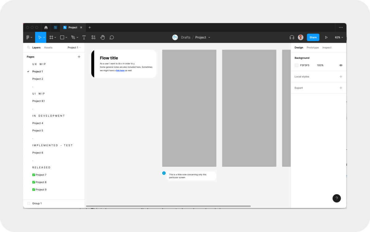
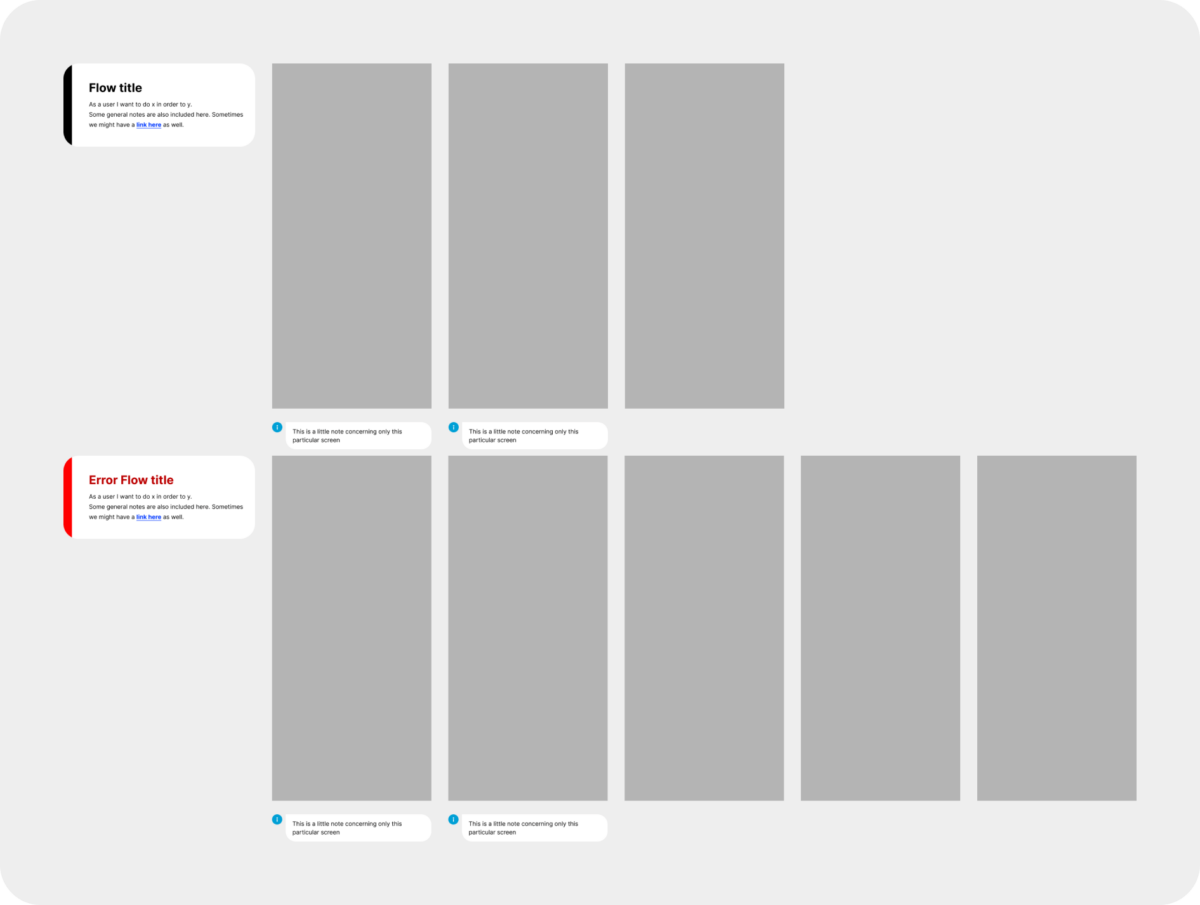
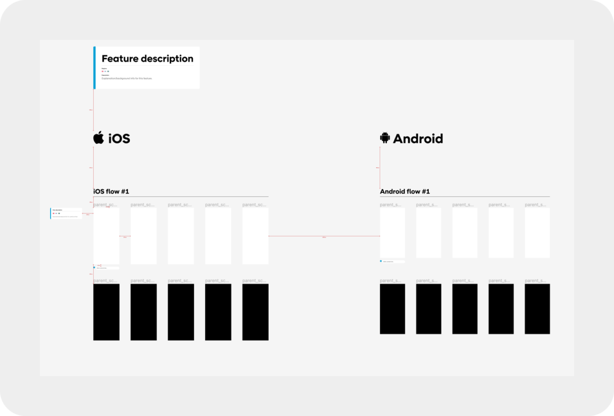
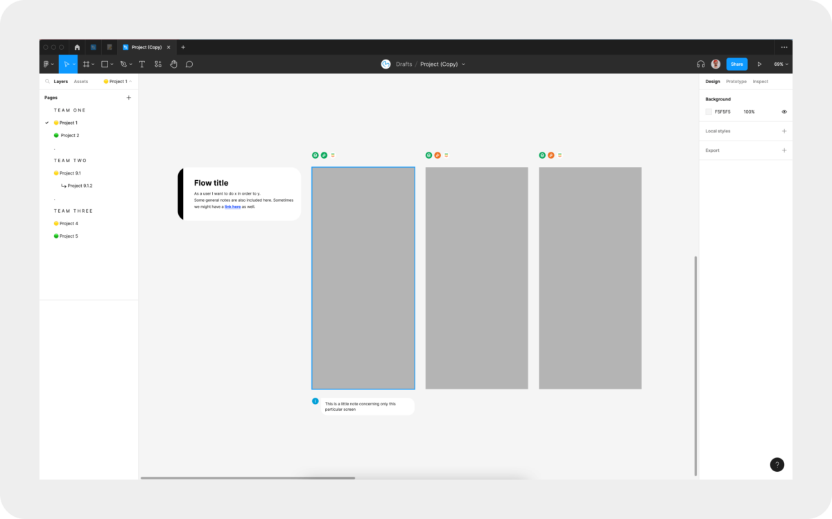
Each project/feature had its own page, and we moved the page between the different sections when the various parts were done. We also designed everything in flows. Each flow had a title, a short description or user story, and any additional information relevant to the flow. If we had any information concerning only a specific screen in the flow (like a note to developers), we added that below that screen. Flows for error cases were usually placed at the bottom and were separated with a red title.
This way, no matter who opened our files got a good overview of what we are working on and which state things are in. The flow-based approach and notes made understanding features and how the product works easy. Developers knew what they could start working on, and QA knew what was ready for testing. Following the flows and comparing implementation to designs was also super easy thanks to the flow-based structure.
When we finished a feature, we copy-pasted the artboards/flows to the right page in the Final Design section and deleted the page in the Implemented section.
This system worked reasonably well for this specific project. It was a new project, Android only, everything in the app was flow-based, and design could always be one or two sprints ahead. It rarely happened that design and development for a feature were done in the same sprint. In that case, we adopted our workflow a bit (again, we still communicated a lot daily).
The first round of updates – different projects, different needs
Some of the other teams adopted this structure and modified it to fit their needs and way of working the best.
One of these teams was my current team. Unlike my previous project, where a more linear process could be applied, things work much more agile in this project. UX and UI often go hand in hand. Sometimes developers start implementing parts of a flow while we are still fine-tuning the design details. This project is also more copy heavy, so often, there is a lot of back and forth with the copy.
We made some changes to the structure to fit our needs.
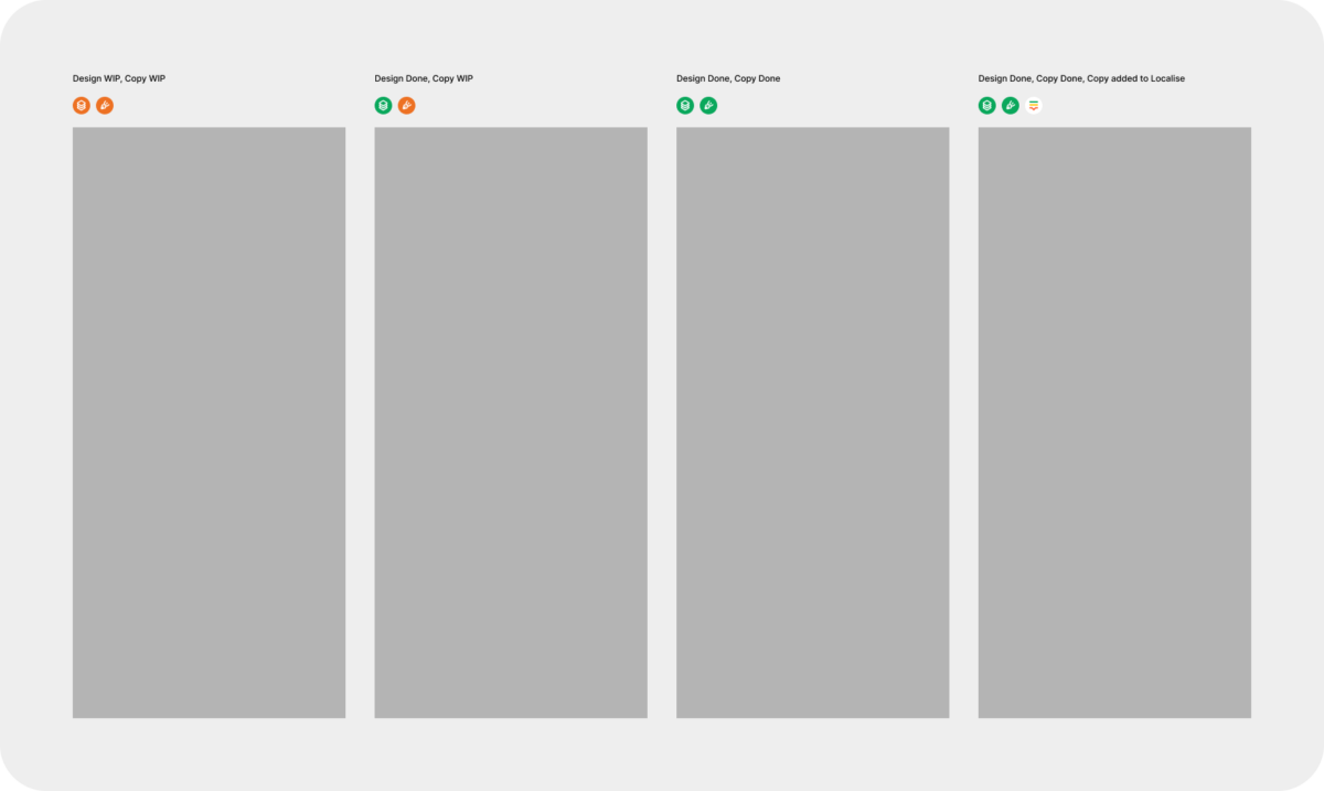
First, we merged the UX WIP, UI WIP, and IN DEVELOPMENT pages because these steps often happened simultaneously. But then, how do you know which state things are in, Jozsef? Excellent question. I like your thinking there. We introduced a little status component which we added above our screens. It shows the status for Design, Copy, and whether we synced the copy to Localise (a tool we use for translations).
We also kept the part of the workflow where everything on the page gets cleaned up once the UX is done and nicely organized once the UI is finalized. We also kept the flow-based approach and the notes. In addition, we also added a description at the top of the page where we included more info about the feature itself, scope, background, and links to Notion, where we keep documentation. This, together with the short descriptions and notes for the individual flows, gives enough context to understand the feature and know how to test.
This project also has both iOS and Android designs and dark mode, so we created page structure guidelines to ensure our pages are consistent and always easy to follow.
The second round of updates – team setup changes
As our team started growing, we split into three different sub-teams, each responsible for different parts of the app (with some smaller overlap here and there). Soon after this change in our team, we realized we needed to adjust our processes and Figma structure again. Instead of the WIP section, we created a section for each team. Now that we had three teams, we started to work on more features simultaneously. With the new team sections, it is easier for everyone to find the project they are working on, but we still get a good overview of what’s going on in the entire project.
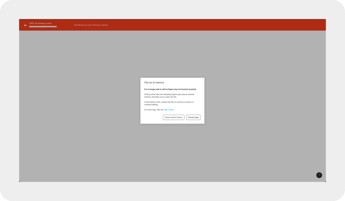
The third round of updates – Your file is too large.
Just when we thought we finally had it figured out, Figma surprised us. As our project grew, we started getting memory warnings. Once you start getting these warnings, you risk access to your file (trust me, we’ve been there and done that, but that’s a story for another day). We split our file to have work-in-progress projects and the final, implemented designs in separate files. Later we split our Final Designs file into individual files, each representing a tab in the app and everything that falls under that. We did this split because of the memory warnings as well.
The overall big Figma setup
Now you got an insight into how we work within our files, and now I’m going to tell you about our project setup quickly. We have an organization account, and within that, we have a team space. In said team space, we have three main folders:
— The primary work folder
— An archive
— Team Figjams
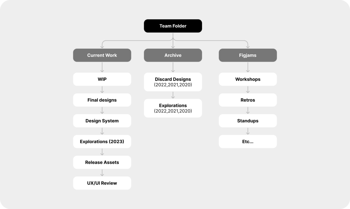
1) The primary work folder
Here we have everything which is currently “active.” We have our Work In Progress and Final design files, which I described previously, our Design System, and a file for release assets (like App Store and Google Play screenshots and banners).
We also have an Explorations file. We have one for every year (like, 2022, 2021, and 2020, but old ones are in the Archive folder) to avoid memory warnings. Let’s say we work on something not planned into our sprints (like doing some explorative UI work or researching something for a potential feature in the future), than we do it in this Explorations file. If something in this file gets prioritized and planned into one of our sprints, we move it to the Work In Progress file. This way, the Work In Progress file always represents projects that are prioritized and planned.
2) Archive
We don’t like deleting things because you never know when an old idea will become relevant again, so we also have Archive files where we move all our unused ideas and old designs. These are also sorted by year in separate files. You know the drill by now.
3) Team figjams
We have a separate folder where we keep our figjams just to keep things clean and easy to find.
I admit I’m a bit too obsessed with structures and order when it comes to design files. I was one of those people who named almost every group and every layer in Photoshop, even color-coded groups. But I believe keeping our design files structured and organized is important. People in a team come and go. A good, easy-to-follow structure makes it easy to onboard new people to the project, whether they are designers, developers, or project managers. It makes it easy for a new designer to get up to speed and start contributing to the project, and it for sure smoothens collaboration and saves a lot of time and back and forth.
Keeping designs organized is also part of our job as designers, and it should be part of the process. Every time I talk about this, I remember the story when Steve Jobs (I know, a Stev Jobs quote, how fitting, but hear me out) argued with engineers about how the inside of the Mac should look just as good as the outside because it’s part of the experience.
The amount of structure you have depends on the size of your team, the scope, and the size of the project. The projects we are working on are long-term, ongoing projects. We often work on a project for several years together with our partners. Most of the projects are also fairly large, and it’s not uncommon for team structures to change. Structures and processes are really important to us. If you have smaller, short-term projects with only a handful of people, you might not wanna put too much effort into structures and can make it work with a pretty simple setup.
Remember, context is always key. There are also many ways to organise your project, I just gave you our example(s). Hope it will help you get started.
Written by: Jozsef Deak
Jozsef has been designing mobile apps for over a decade, when skeuomorphic design was hot, Android had 9patch images and Windows Phone was a thing. He likes nerding out on design systems, figma structures and nitty gritty UI details.